

On 27 March we sent out an email asking “Is your website fit for mobile?” as we geared up for Google’s planned role out of it’s algorithm on 21 April. This change boosted the ranking of mobile-friendly pages on mobile search results and penalised those that were not.
One month on from the change we’re revisiting the topic in a bid to encourage you to embrace responsive web design if you haven’t done so already and convert your desktop friendly website to one that embraces mobiles too.
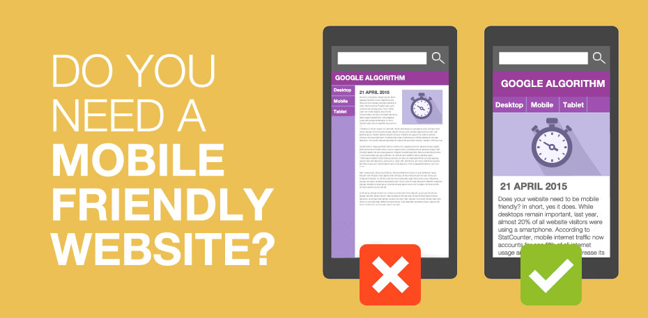
Does your website need to be mobile friendly?
In short, yes it does. While desktops remain important, last year, almost 20% of all website visitors were using a smartphone. According to StatCounter, mobile internet traffic now accounts for one fifth of all internet usage and it’s only going to increase its market share.
Not having a mobile-friendly website can also hurt your rankings in search engines. Since 21 April 2015 Google has confirmed that whether or not your website is mobile friendly will be a ranking factor for mobile searches. If your website is not mobile friendly then you can pretty much wave goodbye to great positions in the search results.
To check if your site is mobile-friendly, you can examine individual pages with the Mobile-Friendly Test or check the status of your entire site through the Mobile Usability report in Webmaster Tools.
But have no fear, once your site becomes mobile-friendly, Google will automatically re-process your pages.
If you’re looking at your search engine results and thinking that the Google’s Mobile Friendly Algorithm didn’t have that much of an impact, Google have said that although the algorithm has been rolled out, the reason we may not be seeing significant changes in the mobile results yet is because indexing and rescoring based on that indexing is not complete. In short, if your site’s not mobile-friendly it will start to slip down in the rankings, if it hasn’t done so already.
Our Work


Hughes & Co Design
Moorside, Colchester, CO1 2TJ
Tel: 01206 795 933
Fax: 01206 795 944
Email: creative@hughesandco.com